Rastervectorgraphics_Sgarcia
Friday, May 20, 2011
Vector Final 1
Using the techniques learned in class I was able to use illustrator to vectorize a photograph and then paint as i desired. I like the outcome because it reminds me of pop art. Illustrator is very useful when trying to make the pop art effect.
This was the original image that I used. I first used the smart blurred to define it and changed into black and white to bring into illustrator.
I then took the image into Illustrator and began live painting and just having fun with it.
Thursday, May 19, 2011
Raster/Vector combined (Book Cover) Final 2
This is the original Image that i blurred in photoshopto make the the lines smoother to bring into illustrator.
Once brought the image to illustrator I went to live trace to vectorize the image and used live paint to change the color of the umbrella and a few other things.
Once I finished my image in illustrator I brought it back to photoshop and extracted only the girl with a layer mask.
Finally I used the original image which is a raster image and converted it to a black and white image and combined it with the vector mask of the girl.
Friday, May 6, 2011
Miniature Dolphin Final 3
In this project I used the techniques we learn in class and because we were doing works involving miniature things, I decided to combine all together.
First all of these images were extracted by layer masks I used the the polygon lasso and magic tool wand.
The dolphin was also extracted by using a layer mask. To make the waster in the glass i used a water image and made it into the shape of the glass. I then created the 3d layer which is the darker part of the water to give it dimension. I downloaded water brushes and added for the splashes.
Finally I added a a beach background to complete the whole project
Tuesday, March 29, 2011
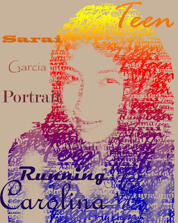
Text Portrait
I did this in a previous class and I wanted to share how it was done.
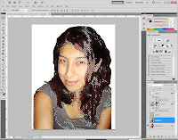
This was the original image i brightened it by adjusting the contrast in image ->adjustments -> Brightness/contrast. Then I went into color range and selected shadows.
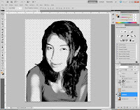
After making the shadow selection and copying it into a new layer I went back and made another selection this time using mid-tones which I also copied onto an new layer then I merged them and this is how it looked.
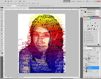
I then used text brushes I had made and randomly painted it all over the portrait.
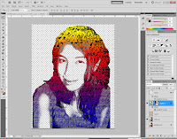
Then I activated the layer painted with brushes, and click on the Add layer mask at the bottom of the Layer palette to add a layer mask.
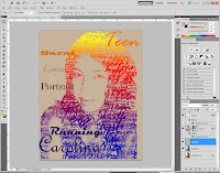
At the end I added a background layer which I filled with a beige color to make the text stand out.
These were the steps I took to make this portrait but I was able to find a link that is more detailed on how to accomplish this kind of text portrait.
http://www.psdtop.com/blog/photo-effects/typographic-portrait-like-grammys-posters/
Friday, March 18, 2011
Cheetah/ Elephant
For this project my goal was to do something out of the ordinary. Something that you would never see in nature. I wanted the elephant to look like a mixed breed between a cheetah and elephant.
This is the original Image that I found in Google.
http://wowallpapers.com/show_wallpaper/animals/elephant_wallpaper_05_1600x1200.jpg.
I then used refine edge to feather and smooth out the edges. The Refine edge helped me get more detail that I had missed by using the quick selection. The refine edge helped me select more precisely.
Once I made my more detailed selection with the refine edge I dropped the cheetah texture image and put it in layer Overlay.
This is the link for the Cheetah texture
http://animalprintwallpaper.com/wallpapers/cheetah-print-wallpaper1.jpg
This is the link for the Cheetah texture
http://animalprintwallpaper.com/wallpapers/cheetah-print-wallpaper1.jpg
I then made a masked the cheetah image layer onto the elephant using the the elephant selection.
I then slightly adjusted curves and made a clipping mask only for the elephant so that the whole image wouldn't be affected by the curve layer.
Overall I like how this project turned out. I like the calm night and anything is possible kind of feel and surrealism. My goal was to make it look dreamlike that's why I chose this background.
With this background it seemed more like a painting drawn on wood material and I like how it looks crafty.
This is the links for the images
Girl
http://fc08.deviantart.net/fs18/f/2007/18/7/9/Mmm___hot_chocolate_by_tennyo_ceres.jpg
Teddy Bear
https://blogger.googleusercontent.com/img/b/R29vZ2xl/AVvXsEjEUOUWw9aaZLmmM4HVknE5iWynn7AhqYAIX4dHLjdsARbjDZQZ4sZFWO6PLEW9LQQLUi5CaRhgAm5zk6VhNvGTW0WFuUmtPu7UO2Aj06S54voK_7C5LAyTRWW6By26xUXO-rXjrlcg_5A/s1600/929+teddy+bear+iii+08-2010.jpg
Tree
http://i248.photobucket.com/albums/gg172/shout_Music/8c5f5938.png?t=1301069480
Original Image.
I used a layer mask to extract the tree drawing and used the brush tools with different opacity to paint the tree.
I did the same for the girl, i used a layer mask to extract her.
I then added a new layer and with a with the brush make a what smokey shape and lowered the opacity to make look more smokey.
Again i used a layer mask to extract the teddy bear and lowered
the opacity and with the eraser tool (opacity lowered for eraser) i erased some of the teddy on its layer mask to make it look smokey/faded.
I tried a wood texture on it.
The added more opacity to the bear because it was too faded.
Subscribe to:
Posts (Atom)